Chapter 8 Pearson’s r and linear regression
8.1 Getting started with this chapter
To get started in today’s chapter, open the project that you made in lab 1. If you forgot how to do this, see the instructions in section 2.2.
Now type these two commands into your Console one by one:
install.packages("ggrepel")
install.packages("modelr")
Now, open a new script file and save it in your scripts folder as “chapter 8 practice.” Copy and paste this onto the page (updating the text so that it is about you):
####################################
# Your name
# 20093 Chapter 8, Practice exercises
# Date started : Date last modified
####################################

#libraries------------------------------------------
library(tidyverse)
library(ggrepel)
library(modelr)
Finally, select all the text on this page, run it, and then save it.
8.2 Pearson’s R
What happens when we are interested in the relationship between two interval variables? Up into now, our solution has been to convert those variables into ordinal variables and use chi-squared, Lambda, Cramer’s V, and/or Somers’ D. However, when we do that, we are throwing out information. For example, if we convert an interval measure of respondent’s age into an ordinal variable coded “young”, “middle aged”, and “old”, we are throwing out the distinctions between, for example, 30 and 31-year-olds (assuming that they both fall into our young category) and between 79 and 80-year-olds (assuming that they both fall into our old category).
Pearson’s R is a test that lets us look at the relationship between two interval variables. It produces a statistic that ranges from -1 to 1, with negative numbers indicating a negative relationship and positive numbers indicating a positive relationship. Although, unlike Lambda and Somers’ D, it is not a Proportional Reduction in Error (PRE) statistic, values farther from 0 indicate stronger relationships, and values closer to 0 indicate weaker relationships (with 0 meaning no relationship).
R makes it very easy to calculate Pearson’s R. You can simply use the command cor.test(). Below, I test the relationship between two variables that I have found in the states2025 dataframe: trumpMargin2024, which is the proportion of a state that voted for Trump in 2024 minus the proportion of that state that voted for Harris in 2024, and reaganMargin1980, which is the proportion of a state that voted for Reagan in 1980 minus the proportion that voted for Carter. My hypothesis is that states that voted for the Republican candidate in 1980 (Reagan) are more likely to have voted for the Republican candidate in 2024 (Trump). In other words, I am hypothesizing that Pearson’s R will be positive. Here is the command:
##
##  Pearson's product-moment correlation
##
## data:  states2025$trumpMargin2024 and states2025$reaganMargin1980
## t = 4.6916, df = 49, p-value = 2.208e-05
## alternative hypothesis: true correlation is not equal to 0
## 95 percent confidence interval:
##  0.3321163 0.7216109
## sample estimates:
##       cor
## 0.5567436
Pearson’s R is a symmetrical test, which means that it produces the same value regardless of which variable you treat as independent or dependent. So, it does not matter which order you enter the variables into a cor.test() command.
Look at R’s Pearson’s R output. R calls this Pearson’s product-moment correlation, which is just another way of saying Pearson’s R. Look at the bottom number of this output: 0.5567436. That number is positive, which is consistent with my hypothesis. It also seems relatively far for zero, although as I noted above, that is more difficult to interpret with Pearson’s R because it is not a Proportional Reduction in Error statistic.
The p-value noted at the top ofthe output is 2.208e-05, which is R’s shorthand for \(2.208*10^{-5}\), which is another way of saying 0.00002208. That is the probability that we would get a sample like this from a population where there was not correlation between our two variables. Since it is (much) lower than 0.05, we can conclude that this relationship is statistically significant. We can also conclude that by looking at the 95% confidence interval around our estimated Pearson’s R value. R reports a confidence interval of 0.332 to 0.722, which does not include 0. Thus, we are 95% confident that there is a positive correlation between our two variables at the population level.
8.3 The scatterplot
To visualize a relationship between two interval variables, we can generate a scatterplot, one of my favorite graphs to generate. Here is the code that we can use to visualize the relationship between those two variables above. In general, consistent with other graphs you have made, remember to put your independent variable on the x-axis and your dependent variable on the y-axis (as always, you can find a template for this graph in the file “Strausz ggplot2 templates” which is in the “rscripts” folder that was in the zipped filed that you should have downloaded in section 1.3.
ggplot(states2025, aes(x = reaganMargin1980, y = trumpMargin2024)) +
  geom_point(alpha=.3)+     #if you'd rather leave off the dots and just
                            #include the labels, you can exclude this line
  geom_text_repel(aes(label = state), size=3)+  #if you don’t have data that you want to
                                                #use to name your dots, leave this line
                                                #off.
  labs(x = "Reagan's margin in 1980",
       y = "Trumps's margin in 2024")+
ggtitle("The 1980 and 2024 presidential elections in US States")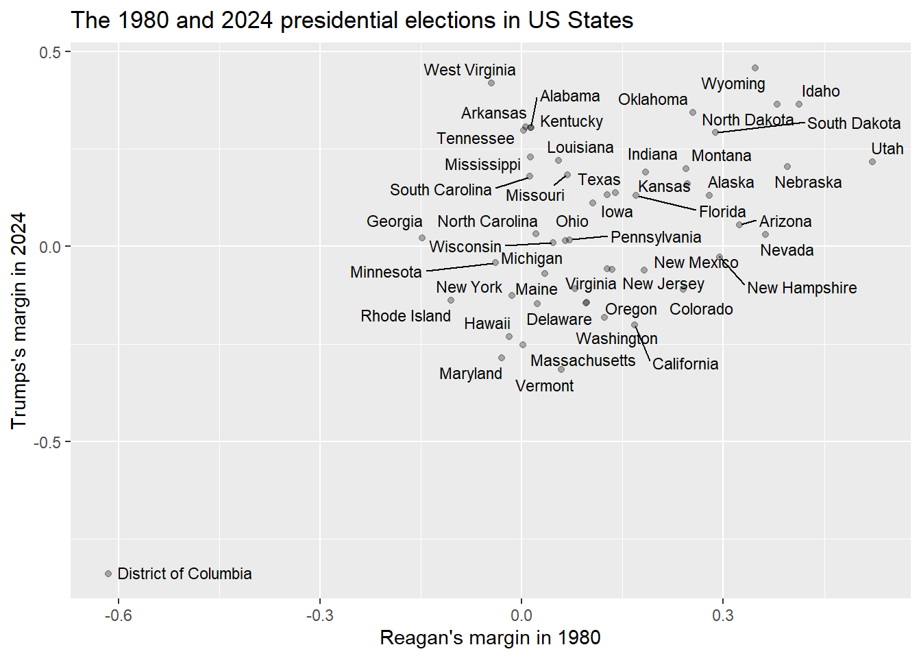
The neat thing about scatterplots is that they display the values of all of the cases of the two variables that you are interested in for all of your data. So, looking at this graph, we can see dots representing all 50 states as well as Washington D.C.
We are also able to label our dots. This is something that is possible when you are comparing a relatively small number of units that you are able to identify in a way that makes sense to your readers. Labeling individual dots usually doesn’t make sense with survey data, such as what we find in the ANES dataframe, because there are many thousands of individuals who took that survey, and they took it anonymously (although we might want to color code the dots for additional variables not captured on the X and Y axes).
The above graph alone tells a pretty clear story about the relationship between our two variables – it is easy to visualize a positive relationship going from the District of Columbia in the bottom left to Wyoming, Idaho, and Utah in the top right. However, what if we wanted to ask R to fit a line to this data? In other words, what if we wanted R to find the line that is closest to all of the points on this graph? To do that, we can add a single line to our code from above:
ggplot(states2025, aes(x = reaganMargin1980, y = trumpMargin2024)) +
  geom_point(alpha=.3)+     #if you'd rather leave off the dots and just
                            #include the labels, you can exclude this line
  geom_smooth(method='lm', formula= y~x)+ #this is the line of code we add here
  geom_text_repel(aes(label = state), size=3)+  #if you don’t have data that you want to
                                                #use to name your dots, leave this line
                                                #off.
  labs(x = "Reagan's margin in 1980",
       y = "Trumps's margin in 2024")+
ggtitle("The 1980 and 2024 presidential elections in US States")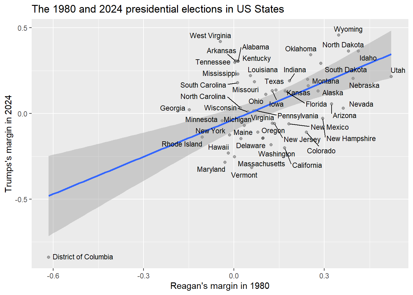
The line on this graph is called a regression line, and it is the line that is as close as possible to all of the dots on this graph. The shaded region around it is a 95% confidence interval. Visualize drawing a line from the top left corner of that region to the bottom right corner. If that line that visualize was horizontal or sloping down, then we could not rule out the possibility that there was no relationship or a negative relationship between the two variables that we are looking at there. But looking at the above graph, even that imaginary line slopes upwards, which is good evidence for our hypothesis.
8.4 Bivariate linear regression
As I mentioned in the last section, the line that goes through the graph that we just generated is called a regression line. Let’s now spend a few minutes reviewing some of what we know about lines from algebra. This is the formula for a line:
Y=MX+B
X is our independent variable, and Y is our dependent variable. M is the slope of our line. In other words, a one unit increase in X leads to an M unit increase in Y (or, if M is negative, a one unit increase in Y leads to an M unit decrease in Y). B is the Y intercept of our line. When X is zero, B will be the value of our line.
When we ask R to draw a regression line on a scatterplot, we are asking R to to find the line that most closely fits all of the points in our scatterplot, and then generate a formula for that line. To generate that formula, R needs to find the slope and the intercept. To ask R to report what slope and intercept it found, we can use this command:
#here we create an object called "model.1" which is our regression analysis
model.1<-lm(formula = trumpMargin2024 ~ reaganMargin1980, data = states2025)

#now we ask R to display the results of that analysis
model.1
##
## Call:
## lm(formula = trumpMargin2024 ~ reaganMargin1980, data = states2025)
##
## Coefficients:
## (Intercept) reaganMargin1980
## -0.03344 0.72737In this code, we must put the dependent variable first, and then the independent variable second. The “lm” stands for “linear model” (because we are asking R to generate the formula for a line). This is the most basic form of regression, an extremely powerful family of statistical techniques that are used across the social and natural sciences. This most basic form of regression is called “Ordinary Least Squared,” or OLS regression, because calculating it involves using linear algebra to find the line with the minimum squared distance between each point in a scatterplot and that line.
Looking at the output, R is giving us two numbers: they are R’s estimates for the slope and the intercept in the formula Y=MX+B. Recall that our independent variable is the reaganMargin1980, and our dependent variable is trumpMargin2024. So, we can rewrite the Y=MX+B formula with those variables, like this:
trumpMargin2024=M(reaganMargin1980) + B
And now we can replace M with the slope (which is right under reaganMargin1980, in our output) and B with the intercept (which is right number the word “intercept” in our output):
trumpMargin2024=.72737(reaganMargin1980) - .03344
This formula represents the best prediction from our regression analysis for any given state’s Trump Margin in 2024, if we were given their Reagan Margin in 1980. If we look at the scatterplot above, we can see that there are many points above that line, and many points below that line, so it would be a mistake to assume that we can predict trumpMargin2024 from reaganMargin1980 with 100% accuracy, but the line represents our best possible prediction. More specifically, the line is making two predictions. First, it is telling us that for every one unit increase in our independent variable (Reagan’s 1980 margin of victory), we predict that Trump’s margin would increase by .72737. Second, it is telling us that in a state with a reaganMargin of 0 (meaning the Reagan and Carter vote in that state was identical), the line predicts a trumpMargin of -.03344 (meaning Harris would have won that state by .03344).
Now we know, looking at the second graph in section 8.3, that this line doesn’t perfectly fit the data. Some points are right on the line, like Florida, but others are far above the line, like Colorado, or far below the line, like South Carolina. In order to get a sense of how well our regression actually fits the data, we can ask R to summarize our regression, like this:
##
## Call:
## lm(formula = trumpMargin2024 ~ reaganMargin1980, data = states2025)
##
## Residuals:
##      Min       1Q   Median       3Q      Max
## -0.35722 -0.15308  0.00016  0.11850  0.48517
##
## Coefficients:
##                  Estimate Std. Error t value Pr(>|t|)
## (Intercept)      -0.03344    0.03276  -1.021    0.312
## reaganMargin1980  0.72737    0.15504   4.692 2.21e-05 ***
## ---
## Signif. codes:  0 '***' 0.001 '**' 0.01 '*' 0.05 '.' 0.1 ' ' 1
##
## Residual standard error: 0.197 on 49 degrees of freedom
## Multiple R-squared:   0.31,  Adjusted R-squared:  0.2959
## F-statistic: 22.01 on 1 and 49 DF,  p-value: 2.208e-05
There is a lot in this output, but there are a few things that you should focus on. First, look at the estimated slope and intercept. Those are the same as above, when we just did the lm() command without summary(). Second, look at the column that says “Pr(>|t|).” That is the significance level of the coefficient and the intercept. In other words, that is the probability that we would see a sample like this from a population where the intercept was 0 and where the slope was 0. The significance level of the intercept is less important, but let’s think about the significance level of the slope. If the slope were 0, then whatever happened to X, Y would not change. Let’s look at the formula to remember why:
trumpMargin2024=M(reaganMargin1980) + B
If our slope (M) were 0, then the estimated Trump margin would be B whatever the Reagan margin was. And thus, there would be no relationship between Reagan margin and Trump margin.
So, if we can say that it is unlikely that the true slope of our line is 0 (because the p-value is below the level of risk of error that we are willing to take, usually set to .05 in political science), then we can conclude that there is likely to be a relationship between our two variables. Since the p-value of our slope is \(2.21*10^{-5}\), we can conclude that we are pretty unlikely to get this kind of data from a population with no relationship between our independent and dependent variables. Therefore, we can conclude that this relationship is statistically significant.
There is one final aspect of this output that we should discuss: the \(R^2\) and adjusted \(R^2\) values. \(R^2\) is a Proportional Reduction in Error (PRE) measure of the strength of a regression relationship. It ranges from 0 to 1, and it tells us the proportion of variation in our dependent variable that is explained by our independent variable. Because \(R^2\) values are often a little bit inflated for some statistical reasons that we won’t get into in this chapter, it is generally better to use the adjusted \(R^2\) to interpret regression results. So, in this case, an adjusted \(R^2\) of .2959 tells us that variation in Reagan’s 1980 margin of victory can account for about 29.59% of variation in the Trump’s 2024 margin of victory.
8.5 Residuals
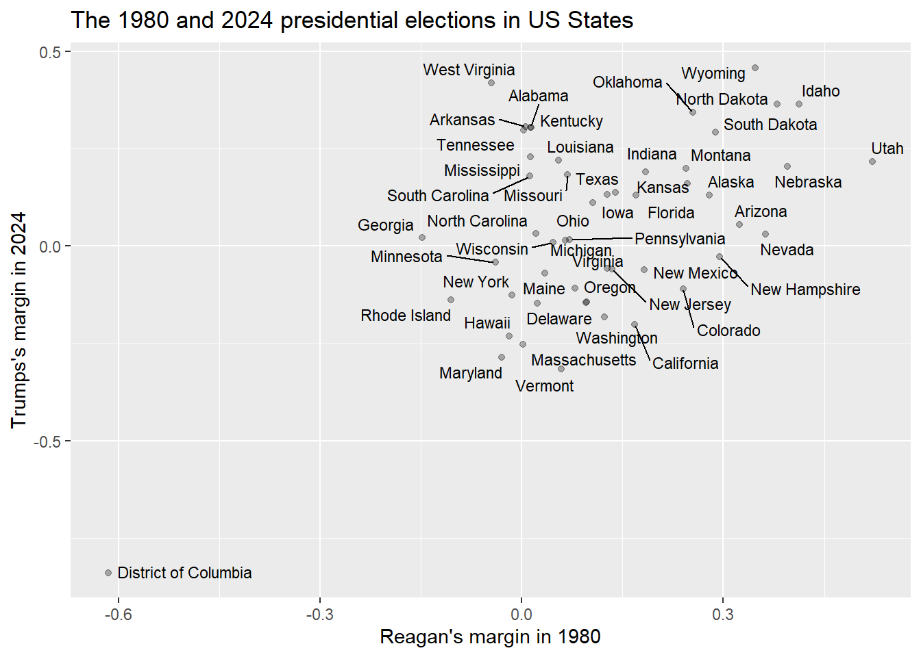
Let’s take another look at the scatterplot of the relationship between the 1980 Reagan margin and the 2024 Trump margin:
If you look at the points in relationship to the regression line, there are some points that seem to be right on the line, such as Rhode Island, some that are pretty significantly above the line, such as West Virginia, and some that are pretty significantly below the line, such as Vermont. Being above the line means that that state’s value on the dependent variable is larger than we would have expected, given the value on the independent variable, and being below the line means that the dependent variable is smaller than expected, given the dependent variable. So, in other words, West Virgina voted for Trump by a bigger margin than we would have predicted given its margin for Reagan (it actually voted against Reagan, and for Carter), and Vermont voted for Trump by a smaller margin than we would have predicted given its margin for Reagan (Vermont voted the opposite way from West Virginia in both elections, voting for Reagan in 1980 and Harris in 2024).
The difference between the observed and predicted value for a given point in a regression analysis is known as the residual. When the residual is positive, that means that the observed value (the value of the dependent variable that we actually see in our data), is larger than the expected value (the value of the dependent variable that is actually on the regression line).
R makes it very easy to calculate the residuals for all of our points. We can do that with the following code. This code will generate a version of our states2025 dataframe called model.1.data that has two new variables:
- pred: the predicted values of the the dependent variable for each value of the independent variable (remember that the independent variable is reaganMargin1980 and the dependent variable is trumpMargin2024).
- resid: the residual for each of our cases (the observed value of the dependent variable minus the “expected value” – the point on our regression line).
To check R’s math, and help you understand the concept of residuals, we can ask R to calculate the residuals by ourselves using the expected values. First, we generate a new variable called resid.check which is just the observed value of the DV for each case minus the predicted value (the point on the line):
Second, we can use the “identical()” command to confirm that our new resid.check variable is the same as the “resid” variable we generated above.
## [1] TRUEThe “TRUE” that we see after we ran the identical() command means that the residual that we generated by subtracting the observed value of our DV from the expected value of our DV is the same as the residual that we generated above with the add_residuals() command. In other words, the add_residuals() command worked.
One thing that the residuals are useful for is identifying cases that our regression equation explains well and less well. To identify find both kinds of cases, we first want to calculate the absolute value of the residuals. This is because residuals are positive when points are above the regression line and negative when points are below the regression line, but we just want to see how far each point is from the regression line (whether above or below). Here is how we use the new command abs() to calculate the absolute value of our resid variable:
That command generates a new variable called abs.resid which is the absolute value of our residual. Now we can use the technique from section 3.4 to find the states that our model does the least good job of predicting. This time we will add the command head() to the end of our sequence so that R will only show the first few cases, rather than all 50 states:
## # A tibble: 6 × 2
##   state                abs.resid
##   <chr>                    <dbl>
## 1 West Virginia            0.485
## 2 District of Columbia     0.357
## 3 Arkansas                 0.335
## 4 Alabama                  0.329
## 5 Tennessee                0.328
## 6 Kentucky                 0.328
Take a look at this output. It shows us the six states and territories in which the 1980 presidential election results did the worst job in predicting the 2024 results. Interestingly, these are all in the South (Washington DC is also in the South).
Now let’s use the same technique to look at the states that our model does the best job in predicting:
## # A tibble: 6 × 2
##   state        abs.resid
##   <chr>            <dbl>
## 1 Michigan      0.000162
## 2 Pennsylvania  0.00120
## 3 Wisconsin     0.00825
## 4 Kansas        0.0155
## 5 Minnesota     0.0198
## 6 Rhode Island  0.0282
Look at these results. Michigan is the state in which the 1980 presidential election results does the best job in predicting the 2024 election, followed by Pennsylvania, Wisconsin, Kansas, Minnesota, and Rhode Island.
8.6 Review of this chapter’s commands
| Command | Purpose | Library |
|---|---|---|
| cor.test() | Generates a Pearson’s R statistic for the relationship between two variables. Variables can be listed in any order and should be written dataframe$variable. | Base R |
| lm(formula = DV ~ IV, data = DATAFRAME) | Generates the slope and intercept for a regression line. Replace DV with the dependent variable you are interested in, the IV with the independent variable, and DATAFRAME with the dataframe that you are using. | Base R |
| summary(lm(…)) | Generates much more data about a regression relationship than the above command. Replace the “…” with the IV, DV, and DATAFRAME the same way that you would with the above command. | Base R |
| add_predictions | Adds predictions from regression analysis to a dataset. Must save the regression as an object and put that object in the parenthesis. Follows the dataset after a pipe | modelr |
| add_residuals | Adds residuals from regression analysis to a dataset. Must save the regression as an object and put that object in the parenthesis. Follows the dataset after a pipe | modelr |
| identical() | Indicates whether two vectors are identical. Put the vectors in the parenthesis, sepeated by a comma | Base R |
| abs() | Calculates the absolute value of a scalar or vector | Base R |