Chapter 3 Graphing and describing variables
3.1 Getting started with this chapter
To get started in today’s chapter, open the project that you made in lab 1. If you forgot how to do this, see the instructions in section 2.2.
We are going to install three new packages to use today. One is called “epiDisplay” and the other is called “Hmisc.” Enter these two commands into your Console one by one:
install.packages("epiDisplay")
install.packages("scales")
install.packages("DescTools")
Now, open a new script file and save it in your scripts folder as “chapter 3 practice.” Copy and paste this onto the page (updating the text so that it is about you):
####################################
# Your name
# 20093 Chapter 3, Practice exercises
# Date started : Date last modified
####################################

#libraries------------------------------------------
library(tidyverse)
library(epiDisplay)   #the tab1 command helps us make nice frequency tables
library(scales)       #this helps us to put more readable scales on our graphs
library(DescTools)
Now select all the text on this page, run it, and then save it.
3.2 Getting started with ggplot and graphing
R has some nice graphic abilities built in, but the ggplot2 package that comes with the tidyverse is even more powerful. In this lab, we will learn to make bar graphs of nominal and ordinal variables and histograms of interval variables.
**NOTE: You can find templates to reproduce all of the graphs from this workbook in the script file “Strausz ggplot2 templates” which is in the “rscripts” folder that was in the zipped filed that you should have downloaded in section 1.3.
3.2.1 Bar graphing a nominal variable
A nominal variable is a variable where the magnitude of differences between the values does not give us any information, and the possible values can be listed in any order without confusing us. R does not have a single way to represent nominal variables, but on the three datasets that I have uploaded for this book I have classified the nominal variables as character variables. R sometimes abbreviates this as <chr>. If you type this into the Console:
glimpse(anes2024)you can see that several of the variables in the ANES dataset are classified as characters, including “marital,” “mil”, and “race”.
If you ever want to know how R has classified a variable, you can us the class() command. For example, if you type
class(anes2024$marital) you can see that R calls the “marital” variable a character variable.
Bar graphs give us a sense of how the cases that we studied are distributed across possible values for a nominal variable. To generate a bar graph using ggplot, you begin with the command ggplot(), and then the first thing you type into the parenthesis is the name of the dataframe that you will be working with. The ggplot package is similar to the dplyr package that uses the pipe (%>%) to mean “and then”, but instead of a pipe ggplot uses a “+”. This code will generate a bar graph of that marital variable (if you enter and run the code, you will see the graph that follows it):
ggplot(anes2024, aes(x=marital))+
  geom_bar(fill = "purple", colour = "black")+
  ggtitle("Marital status of respondents")+
xlab("Marital status")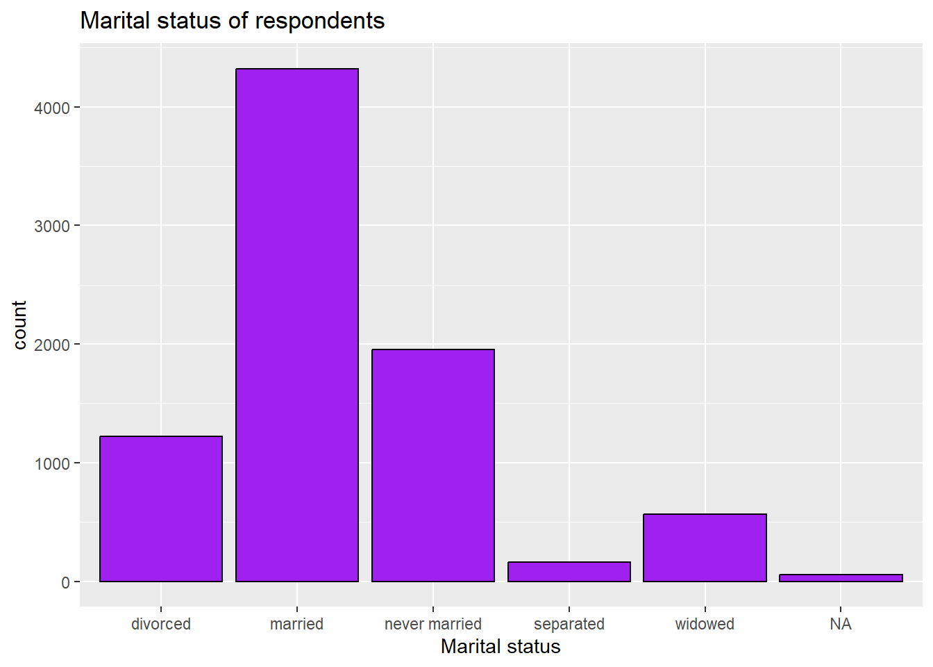
3.2.2 Removing the NA bar
The NA bar represents the number of cases where there is missing data for this question. Often you will not want to include that bar in your graph. To get rid of it, you can use a pipe when you call the dataset and tell R to filter out the cases where “marital” is NA. Like this:
ggplot(anes2024 %>% filter(!is.na(marital)), aes(x=marital))+
  geom_bar(fill = "purple", colour = "black")+
  ggtitle("Marital status of respondents")+
xlab("Marital status")
If you execute that command, you will see that now the NA bar has been removed.
3.2.3 Adding a second line to a graph’s title
While “Marital status of respondents” is not a very long title, sometimes you will have graphs with longer titles that you want R to put on two or more lines. To tell R to move to a new line, just insert “\n” where you want the line break to go, like this:
ggplot(anes2024 %>% filter(!is.na(marital)), aes(x=marital))+
  geom_bar(fill = "purple", colour = "black")+
  ggtitle("Marital status\nof respondents")+
xlab("Marital status")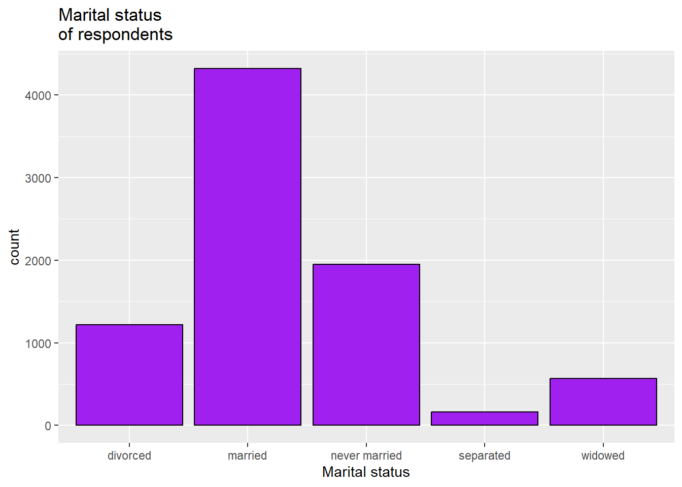
3.2.4 Saving a graph
To save a graph, you can click the export plot menu right above it:
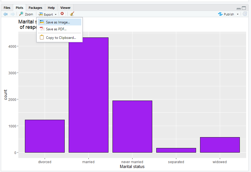
You can either save it as an image, which you will later be able to import into word or other software, or you can copy it to clipboard and immediately paste it into another piece of software. Either of those work.
3.2.5 Bar graphing an ordinal variable
An ordinal variable is a variable where the magnitude of the difference between the values does not give us any information, but the possible values must be listed in a particular order to make sense. R is most willing to treat a variable as ordinal when it is listed as an ordered factor, which R sometimes abbreviates as <ord>. If you type this into the Console:
glimpse(anes2024)you can see that several of the variables in the ANES dataset are classified as ordered factors, including “income”, “bible”, and “religAttn”
Reminder: if you ever want to know how R has classified a variable, you can use the class() command. For example, if you type this:
## [1] "ordered" "factor"you can see from the output R calls the “education” variable “ordered” “factor”.
Another variable that ANES2024 measures ordinally is income. To generate a bar graph of the income variable, we can use this code:
ggplot(anes2024 %>% filter(!is.na(income)), aes(x=income))+
  geom_bar(fill = "purple", colour = "black")+
  ggtitle("Respondent's household income")+
  xlab("Income")
3.2.6 What to do about overlapping labels
If you look at the previous graph, you might notice that the labels at the bottom overlap. This makes it hard to read! To deal with overlapping labels like this, you can add this line to your code (please note that R will not understand this code if you did not install the scales package in section 3.1 and then run the command library(scales)):
scale_x_discrete(guide = guide_axis(n.dodge=2))+This is how our new code looks:
ggplot(anes2024 %>% filter(!is.na(income)), aes(x=income))+
  geom_bar(fill = "purple", colour = "black")+
  ggtitle("Respondent's household income")+
  scale_x_discrete(guide = guide_axis(n.dodge=2))+
  xlab("Income")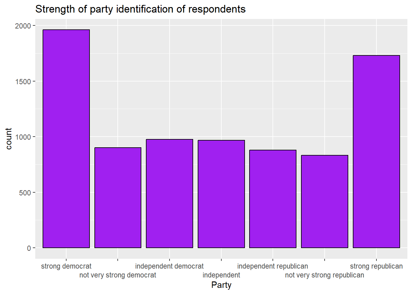
3.2.7 Generating a histogram
An interval variable is a variable where the magnitude of difference between the values gives us useful information and where the possible values must be listed in a particular order to make sense. In this class, it is generally safe to assume that a variable that is neither an ordered factor nor a character variable is interval. However, variables with only two values (such as 0 and 1) should not be treated as interval.
You can, in theory, make a bar graph of an interval variable. However, since interval variables generally have many possible values, those bar graphs become very difficult to read. Instead, we often generate histograms of interval variables. Histograms are bar graphs where each bar represents a range of values of the variable of interest instead of a single bar. For example, here is how we can make a histogram of the population3 variable in our world dataset:
ggplot(world2025, aes(x = pop)) +
  geom_histogram(fill = "purple", colour = "black")+
  ggtitle("Histogram of countries' populations, 2019")+
  xlab("population")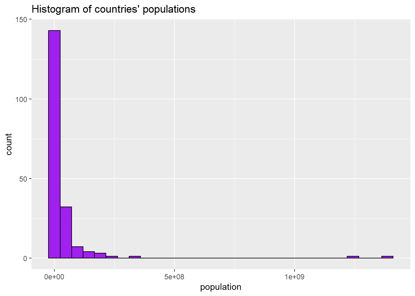
3.2.8 Removing scientific notation from axes
The above graph is ok, but because the population numbers are so big, R has converted them to scientific notation. To force R not to do this, we can use a command made possible by the scales package that we installed in section 3.1:
scale_x_continuous(labels = label_comma())Combined with the rest of our code, we can generate the graph like this:
ggplot(world2025, aes(x = pop)) +
  geom_histogram(fill = "purple", colour = "black")+
  scale_x_continuous(labels = label_comma())+       #gets rid of scientific notation
  ggtitle("Histogram of countries' populations, 2019")+
  xlab("population")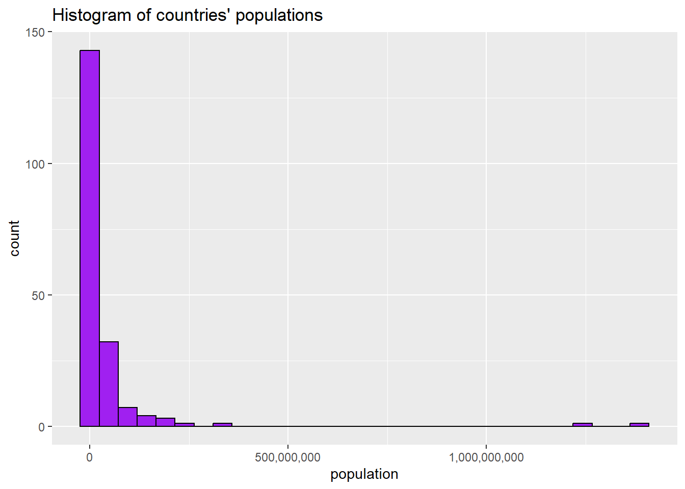
3.2.9 Adjusting bin width on a histogram
The bars on a histogram are called “bins.” Looking at this graph, we can see that R has chosen to set the bins at around 50,000,000. What if we wanted to make the bins narrower? We can set the bin width like this:
ggplot(world2025, aes(x = pop)) +
  geom_histogram(binwidth=10000000, fill = "purple", colour = "black")+
  scale_x_continuous(labels = label_comma())+       #gets rid of scientific notation
  ggtitle("Histogram of countries' populations, 2019")+
  xlab("population")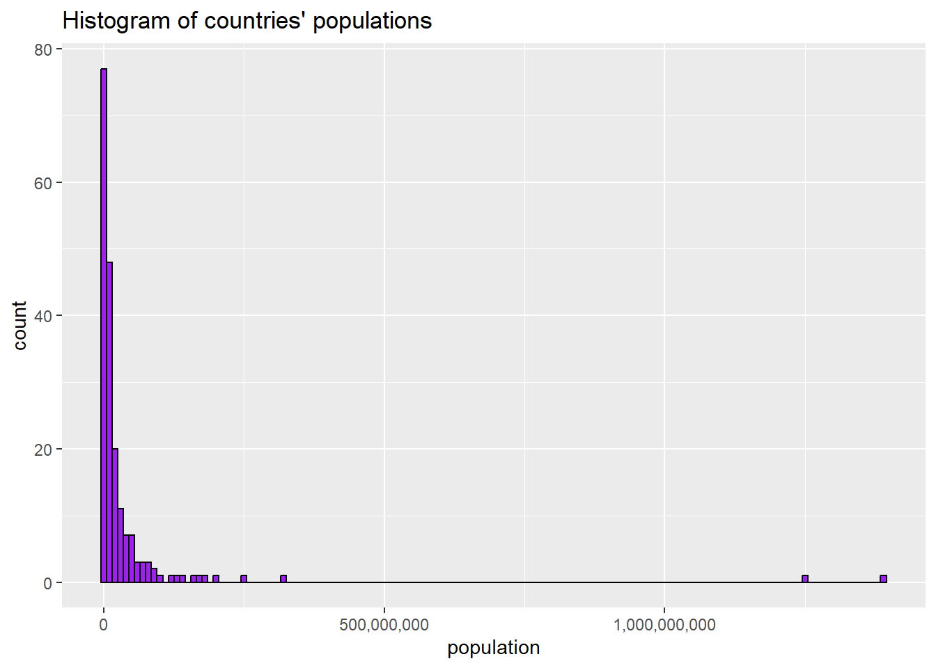
Those narrower bins let us see more of the variation in the variable.
3.3 Central tendancy and dispersion
With all variables, it is helpful to both you and your readers to make observations about their central tendency—what a typical case looks like, and dispersion—how the actual values are spread out across possible cases.
3.3.1 Central tendency and dispersion of nominal variables
With nominal variables, there are two useful techniques to help us discuss central tendancy and dispersion. One is covered above, in section 3.2.1: you can make a bar graph. Second, you can also make a frequency table. To make a frequency table, you can use the table() command to produce a simple one in base R, but the tab1 command that is available through the epiDisplay library that we installed in section 3.1 is more flexible. So, let’s try to look at the region variable from the states2010 dataset. Enter the following into today’s practice R script file, and run it:
#make a frequency table and bar graph of the region variable in states2010
tab1(states2025$region, cum.percent=FALSE)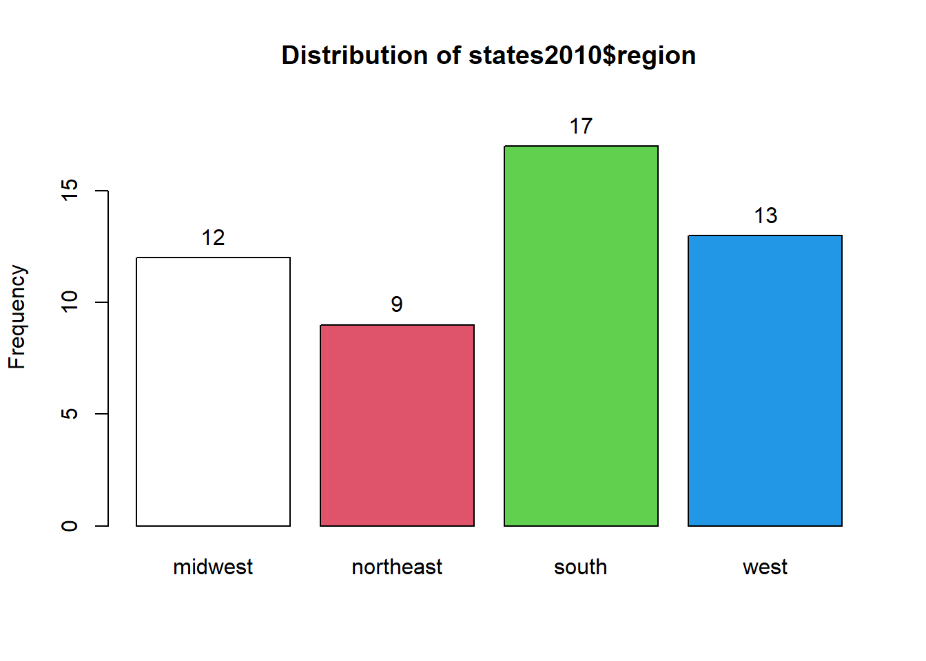
## states2025$region :
##           Frequency Percent
## midwest          12    23.5
## northeast         9    17.6
## south            17    33.3
## west             13    25.5
##   Total          51   100.0
You can see that this command generates two sets of output: a graph that you can see if you click the “plots” tab in the bottom right, and some information in the Console.
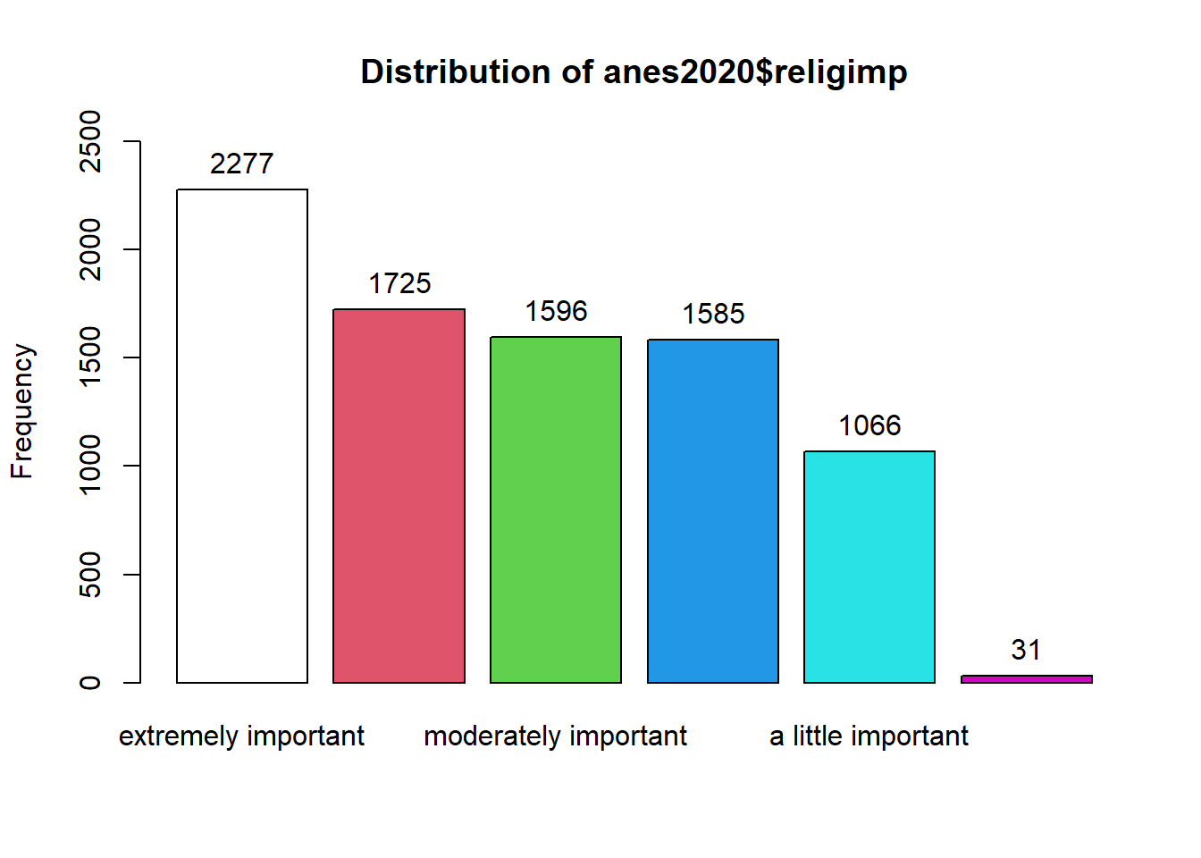
The graph is ok, but the graphs that we generated above are nicer, so we will use those instead.
The information in the Console tells you that there are 12 states in the dataframe that are classified as being in the midwest, 9 that are classified as being in the northeast, 17 in the south, and 13 in the west. The next column to the right tells you what percent of states are in each category.
There is only one meaningful way to measure the central tendency of a nominal variable: the mode. To calculate the mode of a nominal or ordinal variable with only a few variables, you can examine the frequency table and/or bar graph and see which value is the most frequent. You can also calculate the mode with the Mode command (note that the M in Mode is capitalized), which is in the DescTools package that we installed for this chapter. to calculate the mode for the region variable, you type the following into the Console:
Note that I wrote na.rm=TRUE at the end of this command. This is because with Mode command, like several other commands in R, if there are any NAs in the variable that you are asking R to analyze, R will generate “NA” as an output without that na.rm=TRUE.
When you hit enter, you should see this output:
## [1] "south"
## attr(,"freq")
## [1] 17
The first line in this output is telling you that the mode of the region variable in the states2025 dataset is “south.” The third line tells us that “south” occurs 17 times, which is consistent with what we see in the frequency table above.
Regarding the dispersion of this variable, we can look the frequency table and note that no region has a majority of states, and the states seem to be reasonably evenly distributed across regions, with 33.3% of states in the modal region (the south) and 17.6% of states in the least common region (the northeast).
3.3.2 Central tendency and dispersion of ordinal variables
With ordinal variables, we can use the same techniques that we use for nominal variables but with one exception: since the order of the possible values does give us important information for ordinal variables, the cumulative percent also gives us useful information. Thus, we can ask R to report the cumulative percent too. Let’s try it with the results of the question “how frequently do you attend religious services?” that was asked in the 2024 ANES survey. We can use this command (notice how we are now writing cum.percent=TRUE because we are dealing with an ordinal variable):
## anes2024$religAttn :
##                       Frequency   %(NA+) cum.%(NA+)   %(NA-)
## every week                  831     15.1       15.1     30.6
## almost every week           559     10.1       25.2     20.6
## once or twice a month       458      8.3       33.5     16.9
## a few times a year          794     14.4       47.9     29.3
## never                        71      1.3       49.1      2.6
## NA's                       2808     50.9      100.0      0.0
##   Total                    5521    100.0      100.0    100.0
##                       cum.%(NA-)
## every week                  30.6
## almost every week           51.2
## once or twice a month       68.1
## a few times a year          97.4
## never                      100.0
## NA's                       100.0
##   Total                    100.0
R is giving us a lot of information here!
The first column on the left is the possible values, ranging from “every week” to “almost never.” There are also some NAs – cases for which we do not have data on this question.
The second column is how frequently each answer is given. Looking at that column, we can already tell that the modal value is “every week”; 831 of the 5521 people surveyed answered that they attend religious services every week. You can check this answer with the Mode command that we used above: Mode(anes2024$religAttn, na.rm=TRUE).
The third column is the percent of cases with each value, including the NAs for which we have no information.
The fourth column is the cumulative percent including NAs. This is the percentage of cases that got the value of interest or a lower value. So, 15.1% answered “every week”, 25.2% answered “almost every week” or “every week”, 33.5% answered “once or twice a month”, “almost every week”, or “every week”, etc.
The fifth and sixth column repeat the third and fourth column, but they exclude the NAs. In general, you should use the columns that exclude NAs when interpreting your data.
We can look at these cumulative percents to find the median. Focus on the column with NAs excluded – the right-most column. The first value for which the cumulative percent is 50 or higher is the median value of that variable. So, we can say that the median person in our attends religious services “almost every week.”
We can also find the median of an ordered factor using the Median command (with a capital M) that comes with the DescTools package that we installed for thi.s chapter. If you copy and paste this command into your Console–Median(anes2024$religAttn,na.rm=TRUE)–you will get confirmation that the median of religAttn is “almost every week.”
So, now we can make two observations about the central tendency of our religAttn variable – the mode is “every week” and the median is “almost every week.”
What can we say about the dispersion of religAttn? To discuss the dispersion of an ordinal or nominal variable it is helpful to generate a bar graph. We can look at the one automatically generated by tab1, but I prefer the look of the ones that we generate with ggplot. So, we can use the same code from section 3.2.5 to generate a bar graph of this variable (Note that we make the x-axis table disappear with “NULL” because the graph title already explained what the x-axis means):
ggplot(anes2024 %>% filter(!is.na(religAttn)), aes(x=religAttn))+
  geom_bar(fill = "purple", colour = "black")+
  ggtitle("How often Respondent attends religious services, 2024")+
xlab(NULL)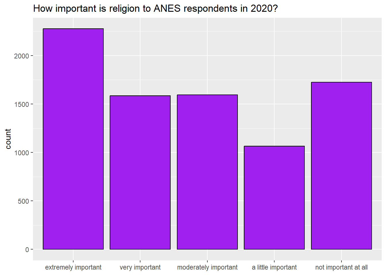
What can we say about the dispersion of this variable? Well, based on the frequency table and bar graph we can say the variable is nearly bimodal and u-shaped. The two largest groups of respondents attend religious services either every week or a few times per year.
3.3.3 Central tendancy and dispersion of interval variables
When we look at interval variables, we can use the mean, median, and mode to discuss the central tendency. R makes it easy to calculate the mean and median, with the command summary() that we learned in section 2.2 (you can also use the commands mean() and median() with the same result). So, for example, let’s look at the variable trumpMargin2024 in the states2025 dataset. This is the proportion of a state’s 2024 vote that went to Donald Trump minus the proportion of a state’s vote that went to Kamala Harris. In other words, it is the proportion by which Trump won or lost a given state.
##     Min.  1st Qu.   Median     Mean  3rd Qu.     Max.
## -0.83800 -0.10950  0.03200  0.04945  0.21050  0.45800
Here, we see that the mean and median, .04945 and 0.03200, are quite close to each other. This is generally a sign that the variable is not skewed. How about the mode? To generate the mode, we can use the same command that we used for nominal and ordinal variables:
Mode(states2025$trumpMargin2024,na.rm=TRUE)If you enter that command into the Console, you will that there are two values that occur twice in the dataset: .131 and .305. Those are both the modes. The mode of an interval variable generally gives us much less interesting information about its central tendancy than do the mean and median, and this case is no exception.
How about the dispersion? With interval variables, we can use a number of strategies to represent the dispersion. We can have R calculate the standard deviation and the interquartile range (the 3rd quartile minus the 1st quartile), and we can generate a histogram. To generate the standard deviation, we can use sd(), and to generate the interquartile range, we can use IQR():
## [1] 0.2347816## [1] 0.32We can also use the code from section 3.2.7 to visually display the central tendancy of our variable, like this:
ggplot(states2025, aes(x = trumpMargin2024)) +
  geom_histogram(fill = "purple", colour = "black")+
  ggtitle("Histogram of Trump's margin of victory in US states, 2024")+
xlab(NULL)
## `stat_bin()` using `bins = 30`. Pick better value `binwidth`.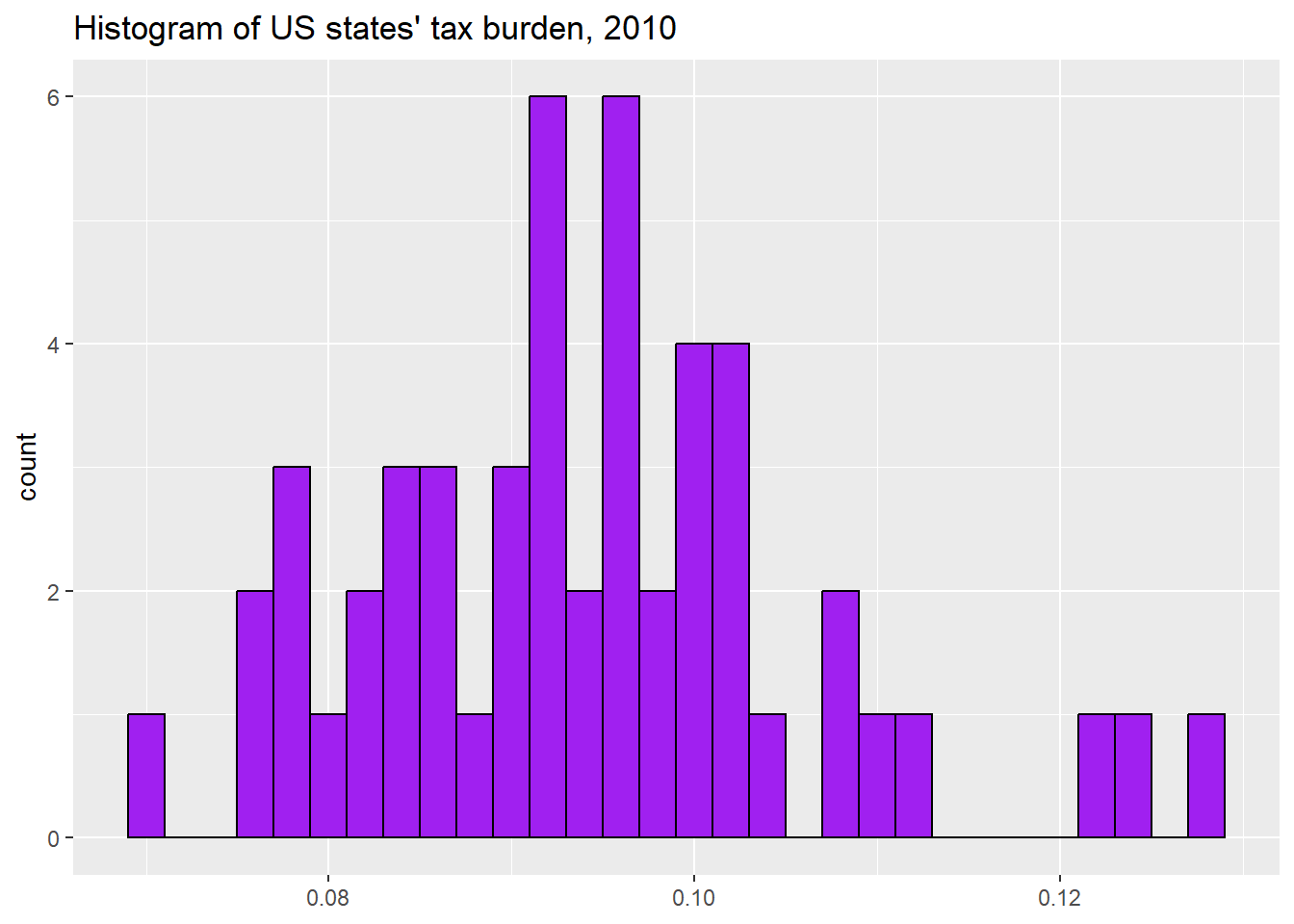
This histogram shows us that this variable is relatively bell-shaped with one very low outlier (one state where Kamala Harris beat Donald Trump by a lot). What might that state be? In the next section, we will learn to answer this question.
3.4 A note on using the states2025 and world2025
When looking at the states2025 and world2025 dataset, there are times when we might want to know which values of a variable come from which states or countries. When we want to know this, the select and arrange commands from the tidyverse can be helpful. For example, this code can help us learn about which states Trump lost by the largest amount:
states2025 %>%
  dplyr::select(state, trumpMargin2024) %>% #focusing in on a few variables
  arrange(trumpMargin2024) #sorting this variable from smallest to largest
                #to sort from largest to smallest, you would write
                #arrange(desc(trumpMargin2024))
When you execute this code, what do you learn about the states that Trump and Harris won by the largest amounts in 2024?
3.5 Review of this chapter’s commands
| Command | Purpose | Library |
|---|---|---|
| class() | Tells us how a specific vector is categorized. Is it a character vector, an ordered factor, etc.? | Base R |
| ggplot() | Begins a ggplot graphic. Feel free to refer to the “20093 ggplot2 templates” script file to find templates for all graphs you will make using this workbook | ggplot2 (tidyverse) |
| mean() | Calculates the mean of a variable. Use na.rm=TRUE if there is some missing data, like this: mean(dataframe$variable, na.rm=TRUE). | Base R |
| median() | Calculates the median of an interval variable. Use na.rm=TRUE if there is some missing data, like this: median(dataframe$variable, na.rm=TRUE). | Base R |
| Median() | Calculates the median of a ordinal or interval variable. Use na.rm=TRUE if there is some missing data, like this: Median(dataframe$variable, na.rm=TRUE). | DescTools |
| Mode() | Calculates the mode of a variable. Use na.rm=TRUE if there is some missing data, like this: Mode(dataframe$variable, na.rm=TRUE). | DescTools |
| sd() | Calculates the standard deviation of a variable. Use na.rm=TRUE if there is some missing data, like this: sd(dataframe$variable, na.rm=TRUE). | Base R |
| IQR() | Calculates the interquartile range of a variable. Use na.rm=TRUE if there is some missing data, like this: IQR(dataframe$variable, na.rm=TRUE). | Base R |